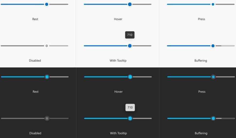
According to the report from Windows Latest reported that Microsoft is taking the redesign of Windows 10 seriously, and the company is now also exploring improvements to store apps. Microsoft is considering some new design changes that will affect the way the application displays ListView, GridView, buttons, and other elements in a non-stationary state (selected, hovered, etc.).
The long-rumored design upgrade has kept Microsoft busy for a while. We have seen the new application icons of Fluent Design and Start Menu in Windows 10. In addition to system-wide improvements, the technology giant will also bring a new user interface to XAML applications.

The design proposed by Microsoft also aims to achieve rounded corners of the project, including selection checkboxes, toggle switches, rating bars, hover effects, etc. in multi-select mode.
According to a new document released by Microsoft, the new design will make XAML Windows applications in line with existing Web and mobile applications, while “looking familiar on Windows.”
Currently, the XAML controls in Windows 10 are inconsistent with the development of web and mobile applications. To resolve the inconsistency, Microsoft is planning to change the default appearance of toggle switches, sliders, and rating controls.

Microsoft also has plans to change the default appearance of various button controls. The general purpose is to achieve more overall consistency throughout Windows 10, from PWA to various Windows Store applications. In the future, Windows 10 may have rounded windows, buttons, toggle switches, sliders, dialog boxes, ListView, GridView, selection menus, etc.
In addition to rounded corners, these application areas will also have other Fluent Design effects when selected, hovering, or other non-stationary states. For example, the ListView item now has a tick mark identifier, and the outer accent color border is now more visible.

It is worth noting that this is only a “proposal”, it is not in the development or testing stage, so there is no guarantee that it will actually be finalized for use in the Windows 10 system.
According to the documents seen, Microsoft also hopes to solve the user interface UI problem, that is, when the user opens the context menu item, the height of the context menu will increase.
(Via)


