According to the latest report, OpenHarmony’s new Logo was released on the recent OpenHarmony Technology Day. Now the designer of the logo, Liu Shi, has brought an interpretation of the design concept of OpenHarmony’s new logo.
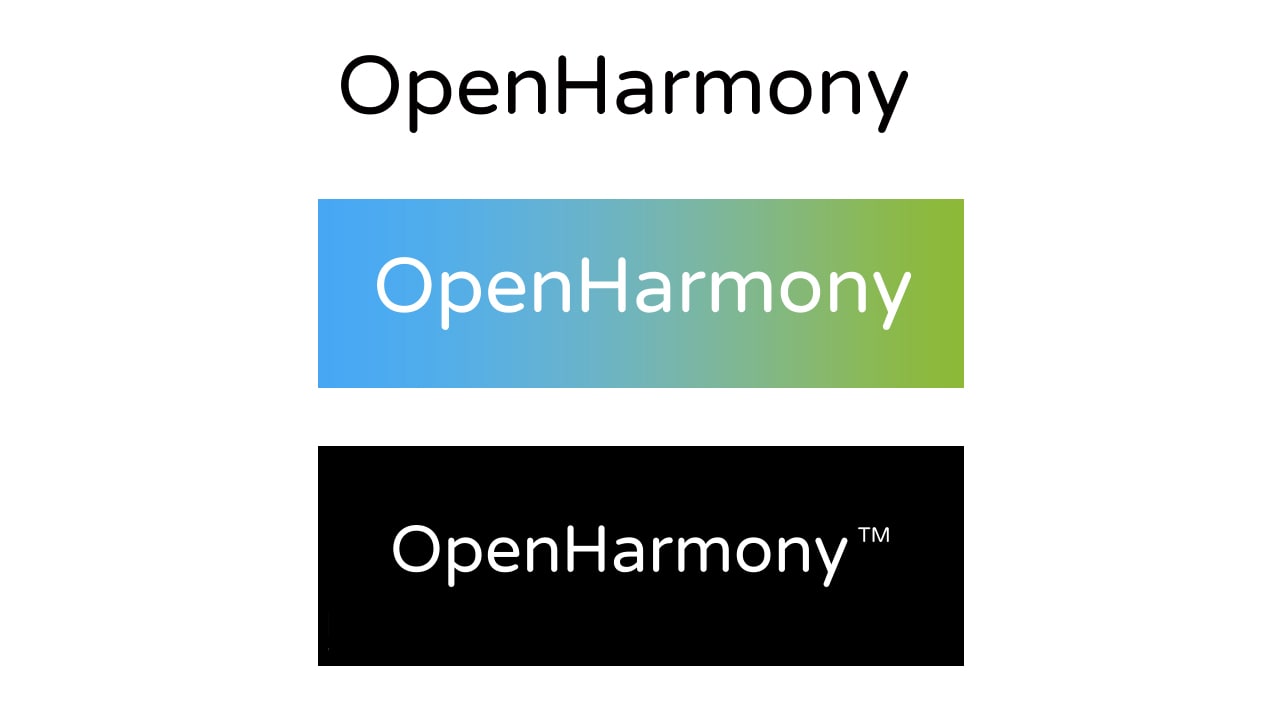
OpenHarmony did not have a suitable logo when it donated to the Open Atom Open Source Foundation in 2020, so it adopted a very conservative approach, that is, using the letter combination of the project name as the temporary Logo of OpenHarmony.
Join tip3x on Telegram
The font of the Logo uses an open-source font: if open pink circle 1.1. A somewhat characteristic design is the blue-green color gradient as the background color.
Among them, blue represents open source innovation, and the green represents ecological prosperity. The gradient from blue to green represents the goal of ecological prosperity through OpenHarmony’s open-source innovation, and the infinite color gradient in the middle extends, implying the possibility of infinite industry distribution applications in all scenarios and fields.
However, simple text and simple color gradients cannot form a clear brand recognition for this major open source project. Designing a graphic logo with a rich connotation is even more urgent.
 The brand design of HarmonyOS emphasizes the circle where all things are unified, all things are derived, and harmonious coexistence, One as All, All as One.
OpenHarmony is the underlying core architecture of HarmonyOS, so the graphic Logo of OpenHarmony needs to clarify this relationship; at the same time, the new Logo must also make it clear that this is an open-source operating system.
First of all, the different parts of this graph represent different co-construction units and community developers: the large circle represents the core co-construction unit and core developers; the small circle represents other units and developers participating in the co-construction.
All co-constructors and developers are in a concentric circle, indicating that they are united in the OpenHarmony community. Different concentric circles represent different application scenarios. Each scenario has multiple co-construction units. Different co-construction units build different industry ecological distributions, indicating that this is a brand-new operating system for all scenarios.
Secondly, the different parts of this graph can also represent different devices: the large part is the rich device (Editor’s note: the rich device refers to the device with a high frequency of use and strong interaction), and the small part is the thin device (Editor’s note: In the OpenHarmony system, terminals with less than 128M of memory are called thin devices).
This shows that OpenHarmony can be developed at one time and deployed on multiple devices on devices with different memory sizes and different screen sizes, enabling flexible deployment. Of course, since these devices are all on a concentric circle, they form a perfect fit, which means that OpenHarmony can realize the interconnection of all things and multi-terminal collaboration between different devices.
Finally, the different parts of the graph segmented represent different atomic services. These installation-free atomization services, some large and some small, indicate that they can be flexibly adapted to different equipment conditions: the large shape can be analogous to FA (Editor’s Note: Feature Capability), which represents the ability with an interface, which can be used with users.
Interaction; small shapes can be compared to PA (Editor’s Note: Atomization Ability), which represents Ability without interface. FA and PA are on a concentric circle, which means that these services themselves have distributed capabilities, which can break the boundaries of devices and realize multi-device linkage in the same scenario, so that applications can be divided, combined, and circulated, such as cross-device editing of emails, Distributed business experience such as multi-device collaboration and multi-screen game interaction.

