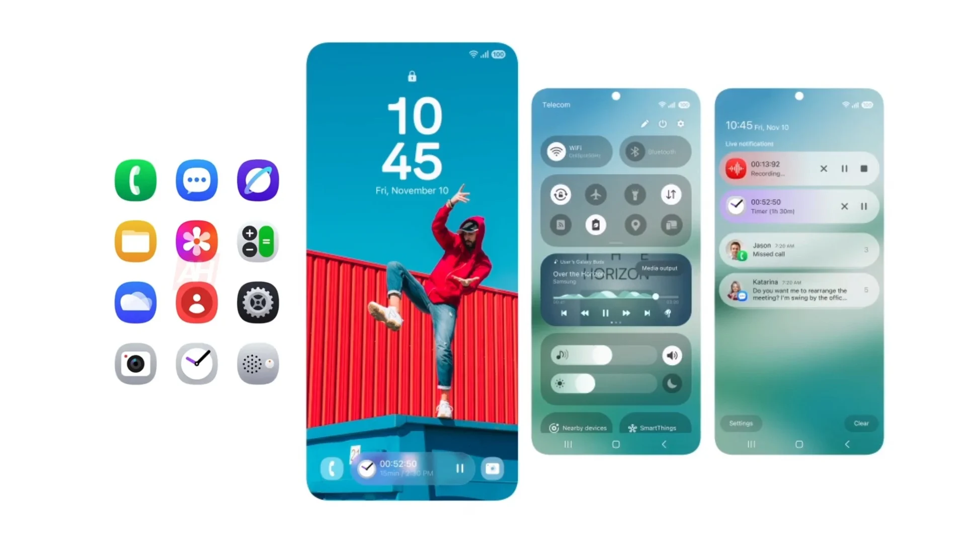
The world of mobile operating systems is in constant flux, with developers continually striving to refine user experiences. Samsung, a major player in the Android ecosystem, is no exception. With the beta rollout of One UI 7, Samsung is signaling a clear focus on visual refinement, particularly in areas often overlooked: on-device resources and language packs. This isn’t just a minor tweak; it’s a conscious effort to elevate the overall aesthetic and create a more cohesive and pleasing user interface.
For years, core system elements like resource icons and language selectors have often remained static, sometimes feeling like afterthoughts in the grand design scheme. Samsung’s One UI 7 aims to change this narrative. By reimagining these fundamental visual components, Samsung is demonstrating a commitment to detail and a desire to provide a truly polished experience from the moment the device is powered on.
One of the most noticeable changes in One UI 7 is the redesign of icons for on-device resources. These aren’t just cosmetic alterations; they represent a shift towards a more modern and intuitive visual language. Imagine interacting with your device and encountering icons that feel fresh, contemporary, and seamlessly integrated into the overall design.
This is precisely what Samsung is aiming for. The new icons adopt a clean, almost minimalist aesthetic, employing a palette of blues and whites that lend a subtle 3D effect. This gives them a sense of depth and tangibility, making them visually engaging without being distracting.
Specific examples of redesigned icons include those for essential functions like the microphone and notes. These aren’t just generic representations; they’ve been carefully crafted to be instantly recognizable and aesthetically pleasing.
The microphone icon, for instance, might now feature a more streamlined design, perhaps with subtle shading and highlights to enhance its three-dimensionality. Similarly, the notes icon could adopt a more modern representation of a notepad or document, conveying its function clearly and concisely. This attention to detail extends beyond individual icons to the overall consistency of the visual language.
Beyond on-device resources, One UI 7 also introduces significant changes to the visual representation of language packs. Selecting a language is a fundamental interaction for many users, particularly in a globalized world. Yet, the visual presentation of language options has often been utilitarian at best.
Samsung has addressed this by introducing a new, unified design for language pack icons. These new icons feature a simple yet effective design: the letter “A” enclosed within a rounded white square. This approach offers several advantages.
First, it provides a consistent visual identifier for all language packs, making them easy to locate and distinguish. Second, its simplicity lends a sense of order and clarity to the language selection interface, improving overall usability. This understated design choice speaks volumes about Samsung’s commitment to creating a clean and uncluttered user experience.
The impact of these visual changes extends beyond mere aesthetics. By modernizing the icons for on-device resources and language packs, Samsung is enhancing the overall user experience in several ways.
Firstly, it creates a more visually appealing and engaging interface, making the device more enjoyable to use. Secondly, it improves usability by making key functions and options easier to identify and access. This is particularly important for users who may be less familiar with technology or who are navigating the device in a language other than their native tongue.
This focus on visual refinement is just one aspect of Samsung’s broader efforts with One UI 7. The company is committed to not just improving the look of its devices but also enhancing their functionality and performance. One UI 7 aims to provide a smoother, more intuitive, and more responsive user experience across the board. This includes improvements to system stability, performance optimizations, and new features designed to enhance productivity and convenience.
For users eager to experience these visual changes firsthand, the One UI 7 beta program is currently underway. Owners of the Galaxy S24 series are among the first to have access to the beta and can explore the redesigned icons for themselves. Samsung is also actively working on future beta releases, with One UI 7 Beta 3 expected to bring further enhancements, bug fixes, and potentially even more visual refinements. This iterative approach to development underscores Samsung’s dedication to delivering a polished and refined user experience.
In conclusion, the visual changes introduced in Samsung’s One UI 7 are more than just cosmetic updates. They represent a deliberate effort to enhance the overall user experience by paying attention to often-overlooked details. By modernizing the icons for on-device resources and language packs, Samsung is creating a more visually appealing, intuitive, and user-friendly interface. This commitment to detail, combined with ongoing efforts to improve performance and functionality, positions One UI 7 as a significant step forward for the Samsung mobile experience.
New icons for Langue packs and On-device resources. #OneUI7 #OneUI #Samsung pic.twitter.com/R9I5Fi8ms0
— Gerwin van Giessen (@GerwinvGiessen) January 3, 2025


